 New York, NY – Wednesday, June 26, 2013
There are a few choices we don’t make for ourselves. We can’t choose our parents, we can’t choose our race, we can’t choose where we are born, and we also can’t choose which corporately registered trademark wielding demagogue controls the money and political sway in our home state.
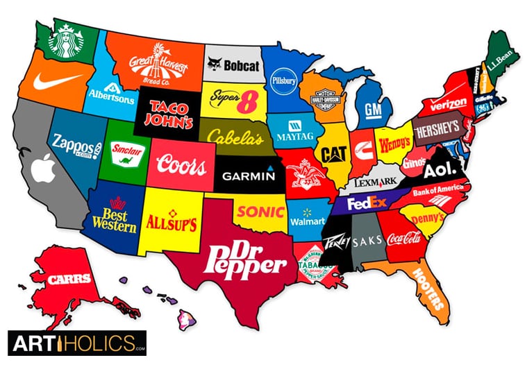
This viral infographic dubbed “The Corporate States of America”(SEE LARGER IMAGE) was created by designer Steve Lovelace and distinguishes each state by the brand that best represents it (most likely the brand is headquartered there and has deep money roots in local economics).
Just because you were born in Pennsylvania doesn’t guarantee 100% that you would prefer Hershey’s chocolate over another brand, but that “preference” would have been ingrained into your prenatal brain from before you could talk. Using Fermi logic, a lot can be inferred from something as simple as the town or state where you were born, and which corporate entity dominates that area.
If you’ve seen documentaries like Detropia, or Roger and Me (add them to your que) you know that mid to large cities are built around industry, usually centering on one or two major corporations. If those factories shut down or go over seas, the city goes to hell in a hand basket.
Even if this map is part tongue and cheek, there is truth behind it, the wizard behind the curtain pulling strings is a logo. Something tells me we’re not in Garmin® anymore.
And in a way (and you will know this if you have ever put together your resumé), aren’t we all a product of our past logos? The bigger the better?

If you like this, you may enjoy: America Divided By Where We Summer: Infographic – Artiholics
Written by Cojo “Art Juggernaut”
[via FastCompany via FastCoCreate]


Leave a comment