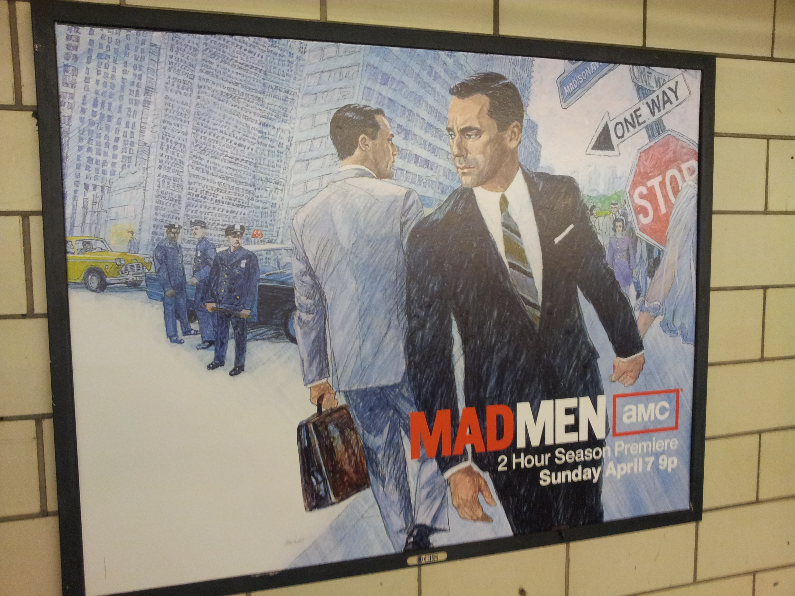
 New York, NY – Tuesday, April 18, 2013
I don’t know if this is just a New York phenomenon or if it’s nation wide but AMC, not wanting loose all of their Walking Dead Audience to GAME OF THRONES pumped a ton of money into one image. An illustration of Don Draper done in 1960s advertising marker, paint, pencil, and gouache mock-up (the way ads were laid out before Photoshop).
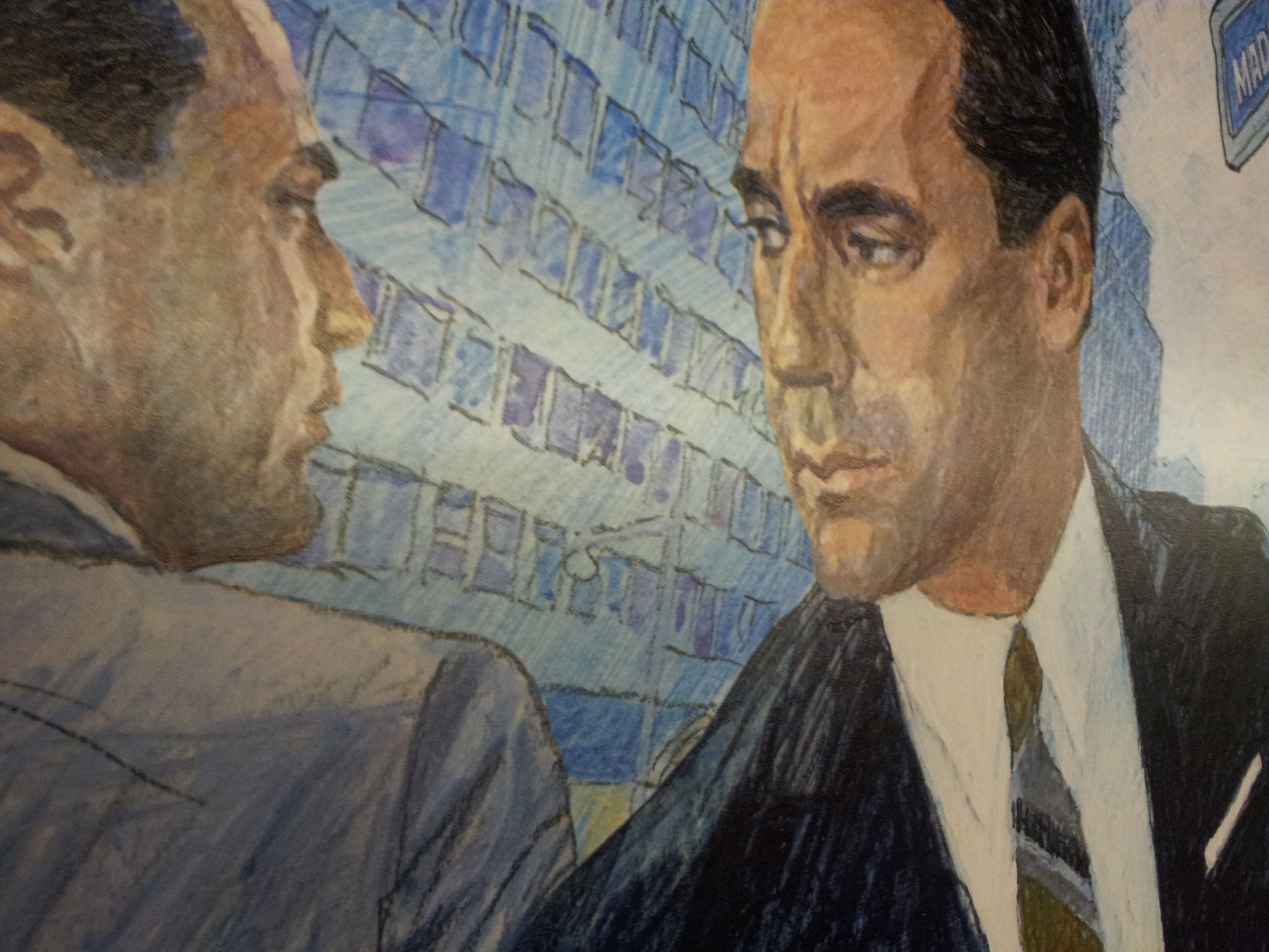 When I saw this ad my first reaction was HELL YES! Traditional illustration for a poster for a modern TV show or Movie is unheard of these days. Other than the Star Wars, Harry Potter, and Indiana Jones type franchises which are now just continuing the tradition because their earlier films posters were done this way and it would be an insult to the brand to do it otherwise, and maybe the odd independent film here and there, but this is mainstream.
I have seen them all over the subways and on buses and maybe like me you were curious as to who drew it. Basically you would be looking at an older illustrator who can still work in a style that for any other product would be dated to that time period, and unmarketable .
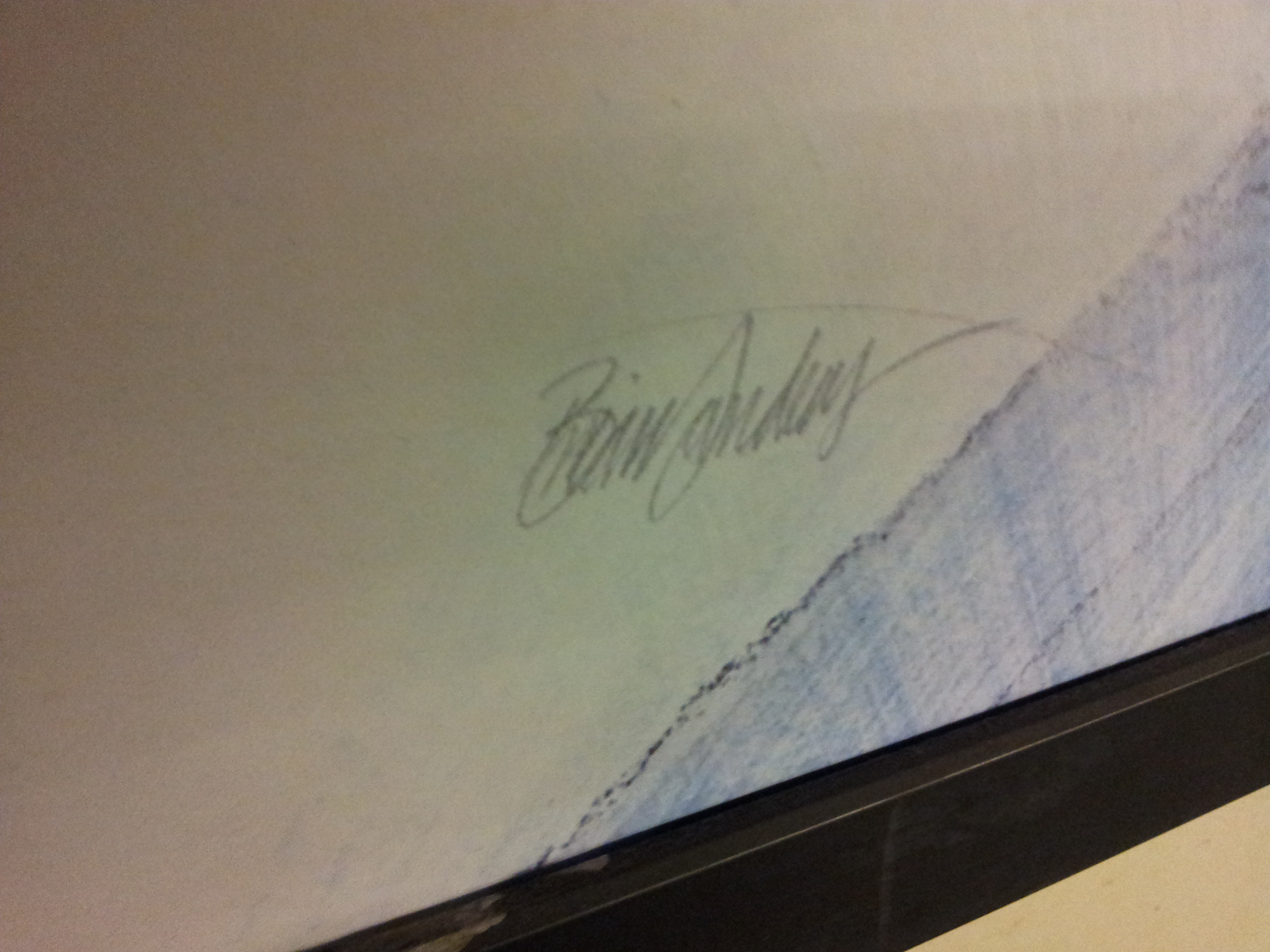
It is signed by the artist, a 75-Year-Old British illustrator named Brian Sanders. In a New York Times article about the creation of the piece they actually show Brian at his drawing table adding some finishing touches (most likely the piece was already finished, and he was just pretending, you know posing for the camera).

The interesting thing is that if you also look at his drawing table (and they don’t mention this in the article in the Times), above the painting are a bunch of printed out comps of the piece ALREADY MOCKED-UP IN PHOTOSHOP. Either the art department at AMC laid out the composition ahead of time and emailed it to him, or they emailed him photos of Don Draper, as well as 1960s era street scene references.
I used to do a lot of illustrations for the British Edition of Maxim Magazine, and I remember that it was always a challenge to draw anything that took place outside. I would have to research online how these things looked in England. From street signs, to fire hydrants, to gutters, to manhole covers. The cops and firefighters all dress differently there, and have different vehicles, fashion, everything is different. I don’t know if they put all of that on a 75-year-old proper British illustrator to google image search and have him send them comps, or if they just handed him the .jpg and said MAKE THIS INTO A 60s style illustration.
Most likely the latter.
Written by Cojo “Art Juggernaut”









Leave a comment